<body><script type="text/javascript"> function setAttributeOnload(object, attribute, val) { if(window.addEventListener) { window.addEventListener('load', function(){ object[attribute] = val; }, false); } else { window.attachEvent('onload', function(){ object[attribute] = val; }); } } </script> <div id="navbar-iframe-container"></div> <script type="text/javascript" src="https://apis.google.com/js/platform.js"></script> <script type="text/javascript"> gapi.load("gapi.iframes:gapi.iframes.style.bubble", function() { if (gapi.iframes && gapi.iframes.getContext) { gapi.iframes.getContext().openChild({ url: 'https://www.blogger.com/navbar/14058325?origin\x3dhttp://croydonian.blogspot.com', where: document.getElementById("navbar-iframe-container"), id: "navbar-iframe" }); } }); </script>

Guess the logo

Tuesday, February 09, 2010
What do people think this is supposed to represent?:


Something to do with meteorite enthusiasm, maybe?  An insurance company?

Anyway, the commissioning entity thinks this:  "we now have a logo which everyone will be able to identify with. It's a nice elegant design..."

And "It is a very straightforward sign containing two clear messages: [..] and [..]".

Best suggestion wins a virtual pint, but an answer will be posted later.

Labels: ,

Logo watch. Or it would be if the EU could get its act together

Friday, October 30, 2009
Straight from EuPravda:


In two months, Sweden will hand over the EU Presidency to Spain. Today, 29 October, Spain, together with the following Presidency holders, Belgium and Hungary, presented its Presidency logo.

Be still my pounding heart.


And I can't see the logo because three blokes in suits are in the way.

However, help would appear to be at hand:


"At a press briefing in Brussels on Thursday, the leaders of Spain, Belgium and Hungary presented their shared logo for the coming 18-month period in the Presidency seat in the Council of the EU....They presented a shared logo and a new standard for the Presidency website address, which better emphasises the trio cooperation. The three Presidency website addresses will be trio.es, trio.be and trio.hu. In a month’s time the trio will present their shared work programme for the coming year and a half".

Here's Trio.es:


Nice, huh?

And Trio.be:


Well, at least there are signs of something having been registered.

And Trio.hu:


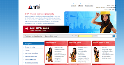
Although not named, I reckoned that maybe there would a trio.eu site  And if you enter that address, something happens.  And what that thing that happens is is that one is redirected to trio.cz, which would appear to be either a workwear retailer or a SFW fetish site for people who like seeing pretty girls dressed up like construction workers.  Anyway, here it is:


Labels: ,

Logo watch, or a £24,315 game of spot the difference for the DCMS

Wednesday, October 28, 2009
From today's Hansard:
Mr. Sanders: To ask the Secretary of State for Culture, Media and Sport what methodology was used to reach the decision to refresh his Department's logo in April 2006; which (a) Ministers and (b) officials were involved in that process; and what steps have been taken to monitor the effectiveness of the refreshment.

Mr. Sutcliffe: The Department decided there was a need for a brand refresh as non-specialist audiences did not recognise our logo and it did not clearly communicate our role. Creative solutions were required to address issues around brand recognition, explaining the responsibilities of the department, and to ensure visual consistency across all applications....
Mr. Sanders: To ask the Secretary of State for Culture, Media and Sport what expenditure his Department incurred in refreshing its logo in April 2006.
Mr. Sutcliffe: The costs were as follows:
    Initial design concepts: £3,055
    Identity design development: £10,460
    Identity guidelines: £10,800
    Total: £24,315.
Mr. Sanders:To ask the Secretary of State for Culture, Media and Sport how his Department assesses value for money achieved in the consistency and distinctiveness of its communications.
Mr. Sutcliffe: Value for money is achieved by using consistent design templates wherever possible, for communications material based on the DCMS brand guidelines in order to reduce design costs.
Due to limited budgets, the Department does not have resources for any wider evaluation.

Right.  Here is the old logo:


I retrieved this via the good offices of the internet archive and the wayback machine - this being atop the DCMS's page on 1/1/2006.  

And today, Culture.gov.uk looks like this:


I am uncertain as to whether that skin crawler of a mission statement (As opposed to all of those non-skin crawler mission statements...) should be read as part of the logo.  Amazing they resisted the temptation to add 'and to boldly go where no man has gone before', frankly.  I have looked at 2007 and 2008, and that guff appears with the logo on some front pages, but not all.

Fans of the more heraldic approach might prefer the original:


Does what it says on the tin, doesn't it?

Labels: , ,

Great logos of our time

Friday, February 27, 2009
Recognise this?:

Probably not, but it is the exciting new logo of the Department of Energy and Climate Change. Some will recall the Department of Energy, extant 1974-1992 but done away with when gas and electricity were privatised (hurrah).

Anyway, before revealing the cost, I will have a go at reading the semiotics of the logo. Firstly - it is blue, which presumably is supposed to evoke the sky and sea, but is also reckoned to be a calming colour. It slants to the right, this representing change, or if you prefer, progress. Look out for this angle in commercial art. It was very popular for cigarette pack shots when they were still advertised. I believe it is also reckoned aspirational. The quadrant in the lower left is presumably the planet, although the lack of landmass is a bit alarming.

I cannot put a name to the font, but block capitals suggests shouting, as E&CC is 'urgent'. And now for the ohmygosh really clever bit - climate and change have no separator space, but 'change' is outside the confines of the logo box. As in thinking outside the box and changing the world etc etc.

Anyway, sold to Milliband minor for "£38,931 on logo design and associated costs". Stationery was a further £19,226.

Labels: ,